Showing posts with label type. Show all posts

6.25.2012

Top 5: Design Cliches to Avoid

It's been said that imitation is the greatest form of flattery. In graphic design, as in other creative fields, imitation can morph a perfectly good idea into a cheap trend. Case in point: Milton Glaser's famous "I ♥ NY" logo. When it first debuted, it was a simple and wonderful tribute to the Big Apple. Now there are a million knock-off variations featuring every major city in the free world, and the iconic logo is no longer innovative nor unique. It's always a sad day in design when a well-done piece becomes inspiration for an over-used trend.

As a designer, I strive to create original work and not mimic what I've seen on billboards or in magazines. With that in mind, I have a growing list of visual cliches to avoid using in design projects. These are the current top 5 on my list.

5. One-Color Logo on Photo
All you need to do to make your logo look super-trendy is to slap it onto a photographic background, the more abstract the better.  Bonus points if you use a picture with bokeh.


4. Statement Left Aligned in Sans Serif Bold All Caps Optional


It doesn't even have to be in complete sentences - but as long as it's left aligned it is now hipster-ready.

3. Faux Letterpress


Actual letterpress - where the letters are embossed into heavy paper - is beautiful. Interior shadows on everything to make it look like letterpress, however, not so much.

2. Applying New Free Font to Everything for "Modern" Feel


Every year or so a font becomes popular among design circles and starts showing up everywhere. In 2010 it was Museo 500, 2011 was the year of Blackjack, and currently the favorite is Wisdom Script (as seen above). I can always tell a font has run its course when it starts showing up on Kroger brand packaging (Museo = yogurt; Blackjack = produce department).


1. Hold Poster So Face Is Hidden


For a while every single poster designer on the internet was photographic their poster designs this way. I guess at least it's a step up from putting a Photoshop layer on it that makes it look like it's been folded an in a box for 20 years?

4.16.2012

Top 5: iPhone Apps

After waiting (rather impatiently), I finally have an iPhone! My home computer, laptop, and mp3 player are all white Apple products, and it had been killing me that my cell phone was a clunky black first-generation Droid. Two weeks ago my phone upgrade was finally available, so I used the money I got back from my state tax return and purchased a shiny white iPhone 4S. Now everything matches! And syncs properly! I'm one happy girl.

Since getting my new phone I've been downloading all sorts of things from the App Store, since so many apps are only available on the iPhone platform. It's weird how some companies wouldn't (or for some reason couldn't) create the same app for the Android system. I actually had a list of all the things I wanted but was not able to download on my old phone, ready and waiting for my upgrade. Below are my favorite (non-gaming) apps so far.

5. Instagram

I had been checking periodically to see when this would be available, and was so excited to finally be able to use it on my new iPhone - then they released the Android version the same weekend as I turned off my Droid. Figures. I love being able to take/edit/share photos so quickly; it's great to be able to share things I'm seeing or experiencing almost instantly. And now it's owned by Facebook, so we'll see how that goes...


4. WhatTheFont

As a graphic designer, I use MyFont.com's What the Font! tool all the time. I even have it pinned to my bookmarks bar next to the link to iStock, that's how often I use it at work. Often we'll get low-res logos and need to replicate them larger, and What the Font! is a super easy way to identify a font when you don't recognize it or know its name. With the iPhone app you can take a picture, run it through the program, and it will tell you the closest font. How sweet is that??


3. Flipboard

I actually discovered this app in an iPad commercial - it was one of the apps loaded on the home screen in the ad. It had a great looking logo (I totally judge apps by logo/user interface) so I looked it up to see what it did. Turns out that Flipboard is basically an RSS reader - it delivers news and updates to your phone either from sources you frequent (such as popular blogs or online magazines) or from a variety of sources on a specific  topic (like technology, book reviews, or celebrity gossip). It's easy to use and gives you a quick visual overview of everything that is happening in your sphere of interest. 

2. SoundHound

I've been using SoundHound for a couple of years on my Droid, and it's one of the few apps that I carried over to the new operating system. It's a music recognition app that you turn on while a song is playing to find out the title and artist. There are other apps that do the same thing but I've always had good luck with SoundHound, with the exception of one locally-based band whose song always came up as some obscure song by The Bangles. Plus it features a giant "start recording" button that is really easy to hit while going 70 on the highway (don't tell my mom I do that). I often use its bookmarking tool to remember songs I want to download later.


1. Evernote

This is one of the best apps ever created, probably in my top 3 after mobile banking and DropBox (that was a LIFESAVER during college - if you don't have it go sign up now!). It's a cloud-type service that lets you save web clippings, photos, and text (for free!) to reference later. What's awesome about this is that you can access it from anywhere - your phone, your desktop computer, or online using any computer. So I can type a grocery list and have it on my phone, or make a note while waiting in line at the bank and have it saved to my laptop, or even save photos and information in a note and collaborate with another Evernote user. I use it to store things I want to post to Pinterest, keep lists of books I am looking for, and keep ideas for future blog posts (yes, there is a whole list of Top 5 ideas!). You can even tag your notes and search them by keyword or category. The possibilities are endless - they already make Evernote Hello (a way to remember people you meet), Evernote Food (for recipes, food photos and restaurant locations), and Evernote Peek (a flashcard app that utilizes the iPad smart cover), but you can use the app for just about anything.

What app do you use often? Anything I need to be downloading?


11.09.2011

Speaking of Typography

In order to counter the "bad type" post from Monday, I thought I would share some of the resources I use when looking for good typography. I don't have the budget to drop $85 at a time on a complete font family, so I rely on independent foundries that offer free and pay-what-you-want downloads. Thankfully with the introduction of the @font-face tag and the wide-spread use of great fonts on the web, more and more typefaces are being made free for downloading and web usage. And, for your enjoyment, some fun font-related games! (If you're into that sort of thing.)

Free Fonts

Font Squirrel 
This is a site that I have bookmarked at work and reference often for beautiful and free type. Not only do they have hundreds of fonts available, but they can be sorted by style and whether or not they are compatible with @font-face. Their @font-face Kit Generator is also a great tool to compile web fonts and create the correct code that you can plug right into your site's CSS. I found the font for my sweet madness logo on this site and use it often!

League of Movable Type
Another great website for finding exquisite typography is at the League of Movable Type. All the fonts hosted there are open-source and available for use with @font-face. Their collection is more about quality than quantity, and as a result they have some really fabulous typefaces. Personally I'm partial to Chunk!

Lost Type Co-op
A recent discovery of mine and one that I already love is the Lost Type Co-op. They have a great collection of lovely and unique type inspired by iconic styles like art deco Miami Beach, the early years of the space program, national parks and steel worker's unions. Many offer @font-face compliance and all feature a "name your price" download, with the option of naming $0 for a free download.

Google Web Fonts
If you're looking for web-safe fonts, a good resource is Google Web Fonts. Google is making hundreds of fonts available for @font-face usage as well as making them open-source and available for download. The site, much like Font Squirrel, makes it easy to compile the fonts for your website and add them to your coding. Designers are also using KickStarter (the fundraising site) to raise money in order to get their work into Google's directory, if you'd like to contribute or donate.

Games & Other Resources

What the Font!
At work we're sometimes given a piece or logo made by another designer and are asked to recreate it. A lifesaver in this process is MyFonts.com's What the Font! tool. Basically you upload an image with a clear shot of the unknown typeface and through the magic of computers it can search the database to find similar fonts. It doesn't always work perfectly, but when it does it can save hours of scouring over fonts to find the exact match.

Kern Type
For all of you type nerds out there (like me!), this game challenges you to kern a word in a specific font and see if you can space it correctly.

Shape Type
From the same group that brought you Kern Type is Shape Type, the game where you alter a letterform and see how closely your work resembles a famous typeface. Do you have what it takes to be a typographer?

Kill Comic Sans
Are you a Comic Sans hater like much of the design world? Then you'll love this first-person shooter game where your target is the infamous typeface. 


11.07.2011

Top 5: Most Annoying Typefaces

Since I started studying to become a designer, I have become a type snob. Like those annoying people who only drink $100+ bottles of vintage wine and cannot fathom why Boone's Farm is still in existence, I use certain fonts and completely shun others. For example, when I have the option of using Helvetica, why should I settle for Arial? If you had the choice between a Lexus and a Kia, which would you choose? I rest my case.

One of my biggest pet peeves since becoming a graphic designer is bad or cheesy type. Or worse, decent type used in the absolute worst way possible. Below are my Top 5 most misused, overused, and otherwise annoying typefaces.

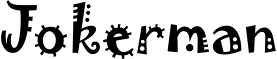
5. Jokerman

If you've ever had an office party you've probably seen this font. Someone took it upon themselves to make up a poster in Word, looked for the kookiest font they could find, and printed it out on neon pink copy paper. I don't think a typeface could have a more stereotypically 90s style.

4. Bleeding Cowboys


This is currently the patron font of county music.  I remember being intrigued by the combination of swashes and wild west spokes the first time I saw it, but now all you have to do is browse the country rack of your local F.Y.E. to find 30 bad examples of it as album cover art. I know you're trying to be a little bit country and a little bit rock and roll, but this isn't the way to do it (I'm looking at you, Daughtry).

3. Curlz MT

Are you working on a cute project? Use Curlz! Actually please don't, but that's the mentality behind the popularity of this font. I've seen everything from baby announcements to bakery logos in this typeface, and every single time it has left me feeling like someone drowned a kitten. It's just wrong. Don't do it.

2. Papyrus


 I've never found the reference, but I'm starting to think that somewhere in the Old Testament it says "thou shalt use Papyrus on church bulletins to represent Biblical times." I have seen more cheesy Easter Sunday pre-designed programs with this typeface than I even care to count. It's also used a lot for Egyptian themed projects, which makes anything about Moses a Papyrus jackpot.
 
1. Comic Sans


If you couldn't anticipate this being #1, then obviously you don't know any designers, because this is a major crux in the design world. It is so hated that there is an entire movement dedicated to getting rid of it (bancomicsans.com). Designers dislike it not just because it's a badly designed font, but because people constantly use it inappropriately. It is not okay to print medical forms for emergency room use in this typeface; it will make your hospital look like it's marketing to babies. It's been used everywhere from daycare logos to public letters to the press (good job, Dan Gilbert) and it always makes the person using it look like they are 12. It's almost sad that this font has turned out so horrible, since the creator based it off of lettering found in the comics The Dark Knight and Watchmen.

*Bonus!*

If you love typefaces and laughing at design inside jokes, check out this video of a Font Conference made by CollegeHumor:


8.29.2011

Top 5: Webding Glyphs

No, the topic today isn't written in a foreign language, it's a typography reference. "Webding" is a typeface of symbols that comes included on most computers for use as bullets and icons. A "glyph" is a specific character within that typeface, like the letter "p" or the @ sign. In symbol fonts like Webding, every glyph is a tiny picture. I was working on a project the other day that needed a large variety of arrows, so I was scrolling through Webding's glyphs to see what was available. I found some hilarious stuff! These are my Top 5 favorites.

Note: I made up the titles of all of the symbols, I have no idea if they have real names out there somewhere.

5. Construction Site


Is this where they build #s? I'm not entirely sure what this is supposed to be.

4. Chipmunk


Is it a chipmunk? A weird looking rat? Is it's tail even connected? Why does it only have one front paw? So many questions.

3. Floating Invisible Man


Hasn't everyone done a project where they thought, If only I had an illustration of an invisible business man floating in midair...? I guess the font designers did.

2. Mona Lisa


You know you're a master painter when your work is reproduced in tiny pixel form. At least they framed it.

1. No Pirating


No shirt, no shoes, no pointy-headed one-eared pirates. I don't think I will ever have a good reason to use it, but it's awesome nonetheless. 

12.09.2010

Ugly fonts make learning easier?

According to Princeton researchers, reading documents in obnoxious typefaces makes our brains work harder to comprehend the information and therefore are more likely to remember it. Maybe our teachers were on to something when every handout was set in Comic Sans...

Everything's better in Helvetica...

even hangers.

See more images here.

4.07.2010

Type Cards

A deck of cards all designed using type! So beautiful. See the entire deck here.

2.06.2010

Quote:

"Men who would letterspace blackletter would shag sheep." - Frederic Goudy


That is the correct quote. E. Ginger did the research for “Stop Stealing Sheep”, and she actually spoke to an old lady who had been to the event and heard Goudy say the “s” word. Patrick Ames, then publisher for Adobe Press, loved the quote, suggested it as the title for the book and changed it, for obvious reasons. The book was intended for typographic novices, and those were obviously not deemed grown-up enough for real four letter words. I always thought the title way too obscure, but I do have a collection of model and toy sheep (too small to shag), because lots of friends think it very funny to give me sheep as presents.

- Erik Spiekermann, typophile.com

Common Typographic Diseases

Various forms of dysfunction appear among populations exposed to typography for long periods of time. Listed here are a number of frequently observed afflictions :

Typophilia

An excessive attachment to and fascination with the shape of letters, often to the exclusion of other interests and object choices. Typophiliacs usually die penniless and alone.


Typophobia

The irrational dislike of letterforms, often marked by a preference for icons, dingbats, and—in fatal cases—bullets and daggers. The fears of the typophobe can often be quieted (but not cured) by steady doses of Helvetica and Times Roman.


Typochondria

A persistent anxiety that one has selected the wrong typeface. This condition is often paired with OKD (Optical Kerning Disorder), the need to constantly adjust and readjust the spaces between letters.


Typothermia

The promiscuous refusal to make a lifelong commitment to a single typeface—or even to five or six, as some doctors recommend. The typothermiac is constantly tempted to test drive “hot” new fonts, often without a proper license.

- Ellen Lupton

1.25.2010

Design + Baking


Helvetica cookie cutters! Wish I'd thought of it.


via Beverly Hsu

1.23.2010

Garage


Check out this sweet environmental graphic in a parking garage! via designer Axel Peemoeller.

Related Posts Plugin for WordPress, Blogger...